1. Overall statistics about total distance and driving time
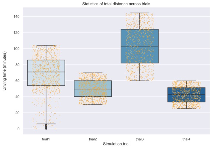
I had set up 4 experiments with selection of 5 abodes each time and run the program. For each trial, I found its statistical variance, as the boxplot shown below.
Figure 12 analyzes statistics of routes' total driving distances.
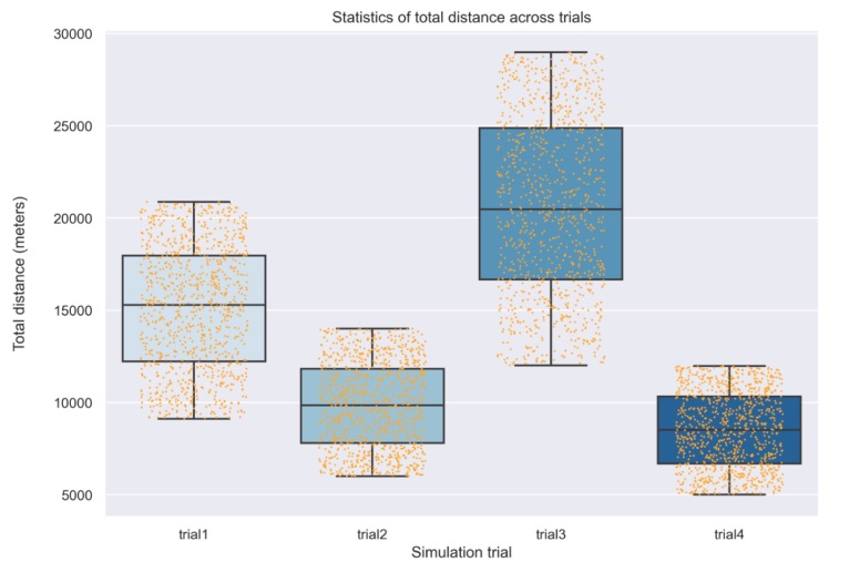
Figure 13 analyzes statistics of routes' total driving time. The trial 1 clearly shows more widespread data points compare to others.
2. Statistics about optimal, average, and worst routes
Note: here I assume the speed of pickup truck is constant and equal to 7.5 mph, or 201 meters per minute. (This unit is chosen for convenience in the program's calculation) ((G.S., H.C., S., Jones, and E., 2016)
2.1 Total distance
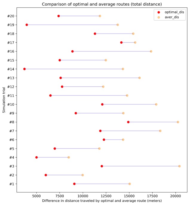
Figure 14 analyzes the optimal and average route in each trial regarding their total travelled distance. Note that in order to better show the performance of the program, I conducted 15 more trials, in total of 20 trials during the following analysis.
2.2 Fuel consumption
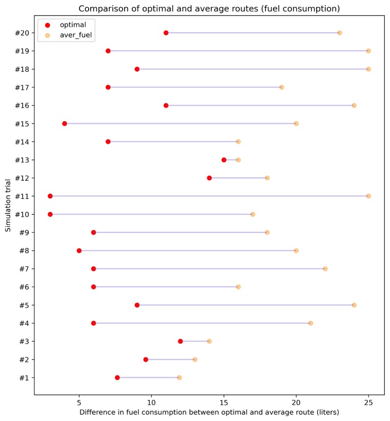
Figure 15 analyzes the reduction in fuel consumption using optimal and average route in each trial.

2.3 CO2 emission
Figure 16 analyzes the CO2 emission of the optimal route in comparison to the average route and their difference, assuming the program lasts for one year and covers all China's residential area, as described in 5.3.5. Note that for sake of clarity of the graph, I only included four trials out of 20 trials I have simulated.
